
Class 11 Economics Chapter 10 Presentation of Data, (Assam Higher Secondary Education Council) AHSEC Class 11 Economics Question Answer in English Medium each chapter is provided in the list of AHSEC so that you can easily browse through different chapters and select needs one. Assam Board Chapter 10 Presentation of Data Class 11 Economics Question Answer can be of great value to excel in the examination.
AHSEC Class 11 Economics Chapter 10 Presentation of Data


Class 11 Economics Chapter 10 Presentation of Data Notes cover all the exercise questions in SCERT Textbooks. The SCERT Class 11 Economics Chapter 10 Presentation of Data Solutions provided here ensure a smooth and easy understanding of all the concepts. Understand the concepts behind every chapter and score well in the board exams.
Presentation of Data
Chapter – 10
PART – B
VERY SHORT ANSWER QUESTIONS
1. Choose the correct sentence :
(a) Bar diagram is a
(i) one-dimensional diagram
(ii) two-dimensional diagram
(iii) diagram with no dimension
(iv) none of the above
Ans: (i) one-dimensional diagram
(b) Data represented through a histogram can help in finding graphically the
(i) mean
(ii) mode
(iii) median
(iv) all the above
Ans: (ii) mode
(c) Ogives can be helpful in locating graphically the
(i) mode
(ii) mean
(iii) median
(iv) none of the above
Ans: (iii) median
(d) Data represented through arithmetic line graph help in understanding
(i) long-term trend
(ii) cyclicity in data
(iii) seasonality in data
(iv) all the above
Ans: (iv) all the above
2. Width of bars in a bar diagram need not be equal (True/False).
Ans: False.
3. Width of rectangles in a histogram should essentially be equal (True/False).
Ans: True.
4. Histogram can only be formed with continuous classification of data (True/False).
Ans: True.
5. Histogram and column diagram are the same method of presentation of data (True/False).
Ans: False.
6. Mode of a frequency distribution can be known graphically with the help of histogram (True/False).
Ans: True.
7. Median of a frequency distribution cannot be known from the ogives (True/False).
Ans: True.
8. What is diagrammatic presentation of data ?
Ans: It is a geometric technique of presenting numerical information through bar diagrams, rectangles, pie diagrams, pictograms or cartograms.
9. Define bar diagram.
Ans: A bar is thick wide line whose width varies according to the choice of investigator but length depends upon statistical information given.
10. Define pie-diagram.
Ans: It is a circle which is divided into various segments representing certain portion of the circle as a proportion of the total.
11. Why statistical information is presented through diagrams ?
Ans: To have at a glance effect or visual effect on the reader.
12. What is meant by multiple bar diagram ?
Ans: It is a set of adjacent bars without any gap, but uniform gap in each set of bars.
13. What is meant by graphic presentation ?
Ans: It is geometric expression of statistical information.
14. Define time series graph.
Ans: When statistical series with the occurrence of time, it is known as time series graph.
15. Define Histogram
Ans: It depict the history of a time factor relating to a particular statistical enquiry.
16. Define an ogive.
Ans: It is a graphic presentation of cumulative frequency.
17. What is meant by frequency polygon ?
Ans: It is line graph having more than four sides.
18. What is shown on x-axis and y-axis on a graph paper ?
Ans: Independent variable on x-axis and dependent variable on y-axis.
SHORT & LONG TYPES ANSWER QUESTION
1. What kinds of diagrams are more effective in representing the following ?
(i) Monthly rainfall in a year
(ii) Composition of the population of Delhi by religion
(iii) Components of cost in a factory
Ans: (i) Simple bar diagram.
(ii) Sub-divided bar diagram.
(iii) Pie-diagram.
2. How does the procedure of drawing a histogram differ when class intervals are unequal in comparison to equal class intervals in a frequency table ?
Ans: When histograms are drawn for unequal class intervals, following two adjustment are made―
(a) Adjustment factor for frequencies with unequal class interval is taken as―
Adjustment Factor = Class interval/ lowest class interval.
(b) Divide each frequency with adjustment factor. This frequency is to be plotted on graph paper.
3. Name four types of one dimensional diagrams.
Ans: The name four types of one dimensional diagrams are:
(a) Line diagrams
(b) Simple bar diagrams
(c) Multiple bar diagrams
(d) Sub divided bar diagrams.
4. Mention the advantages of diagram.
Ans: The advantages of diagram are :
(a) Makes the data simple and intelligible
(b) Attractive and Impressive
(c) Makes comparison possible
(d) Lasting effect
(e) More informative
(f) Universal utility.
5. Write the limitations of diagrammatic presentation.
Ans: The limitations of diagrammatic presentation are :
(a) Misuse by the investigator
(b) Give only rough idea
(c) It is a complex technique.
6. Mention the advantage of graphs
Ans: The advantage of graphs are :
(a) Graphs are attractive, interesting and effective
(b) Saving of time and labour
(c) Helpful in comparison
(d) Forecasting and projections
(e) Location of averages and other measures.
7. Write the limitations of graphs
Ans: The limitations of graphs are :
(a) It does not provide information about actual values
(b) Possibility of drawing wrong conclusions
(c) Difficult for a layman to understand
(d) Difficult to show minor differences.
8. Give the objectives of diagrams.
Ans: The objectives of diagrams are :
(a) It makes mass complex data comprehensive
(b) It makes vast data comparable
(c) To have eye catching and long lasting effect
(d) To makes statistical information attractive and entertaining.
9. Distinguish between diagram and graphs.
Ans: A diagram is drawn on a plain paper showing length and breadth of the data. It is presented by the rough bars, rectangles, pie diagram etc.
A graph is drawn on graph paper showing arithmetic line graph and frequency distribution. Histograms and oghus are most important graphs.
10. Distinguish between Histogram and Histogram
Ans: A histogram shows data with the reference of time element. It may express one two or more variables with time. It forms time series graphs or Arithmetic time graphs.
Histogram is a set of vertical bars drawn from continuous variable. It is helpful in locating the value of mode.
11. Define Simple Bar diagram.
Ans: Simple bars are very common form for presenting simple variable diagrammatically. Here, the breadth of all the bars must be equal to each other. Besides, equal distance must be kept between different bars to make them symmetrical and attractive. The width of the bars is immaterial yet it must be proportional to the lenght of the bars.
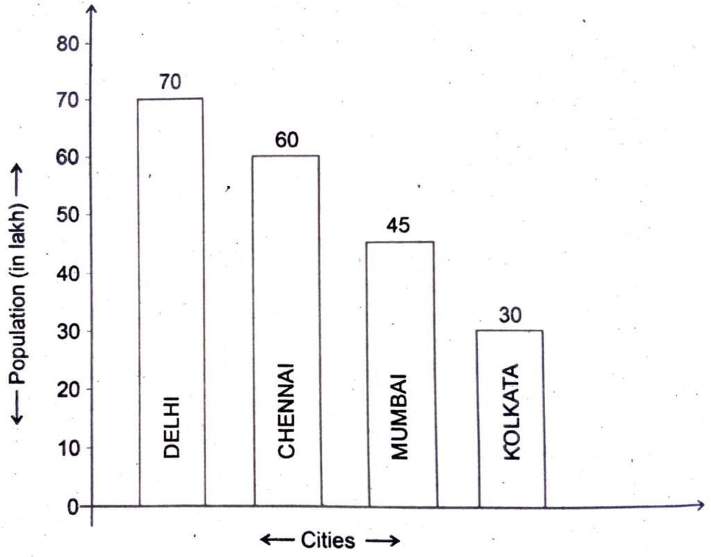
12. The population of four big cities of India during 2008 is given as under :
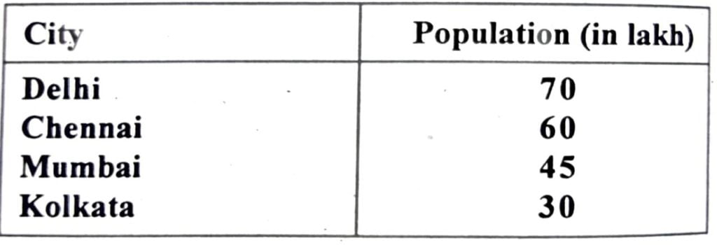
Present the data by suitable bar diagram.
Ans: Given data is presented by the following simple bar diagram–
13. Define Multiple Bar diagram.
Ans: It present a set of adjacent two or three bars without any gap, but uniform gap in each set of bars. To distinguish between different bars, different colours, shades, doting or crossing may be made along with index to this effect. This type of diagrams are drawn basically to compare more than one inter related variables.
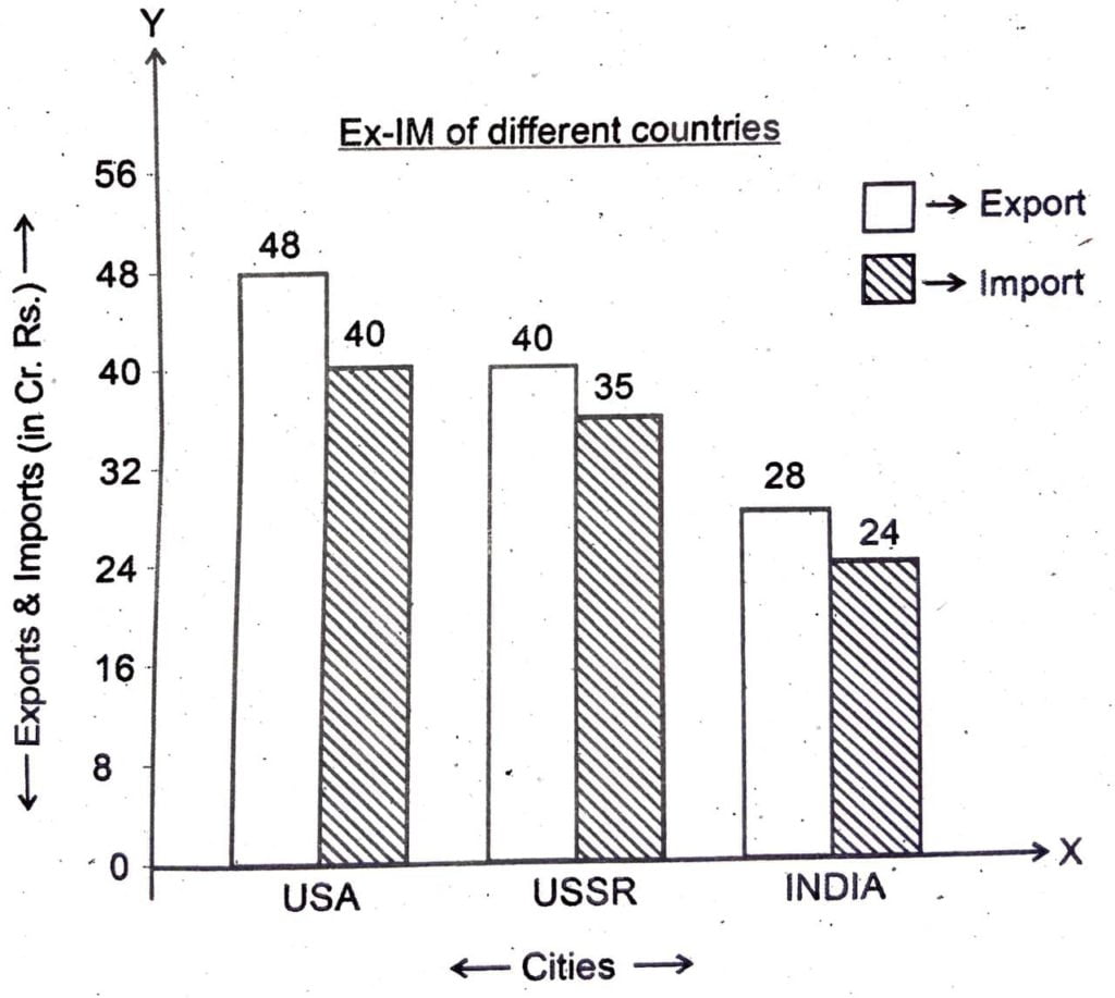
14. Draw a multiple bar diagram for the following data.
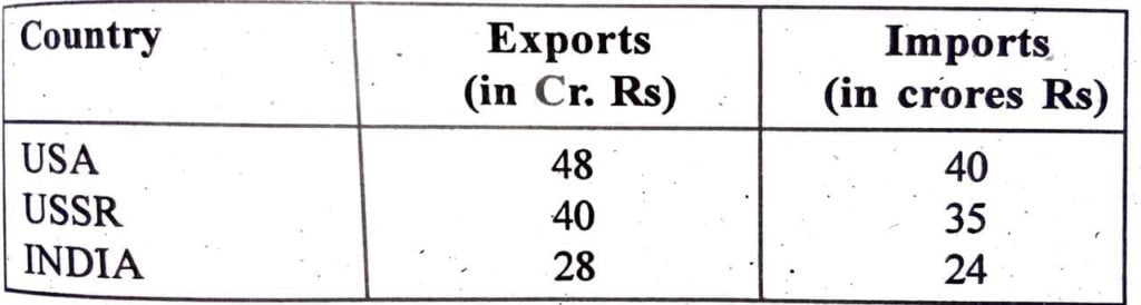
Ans: Given data is presented by the following multiple bar diagram
15. Define sub-divided bar diagram
Ans: This diagram is constructed by subdividing the bars in the ratio of various components. It is used to depict different components of a variable. Various component parts are distinguished from each other by using different lines, dots, crores or colours. It is also known as component bar diagram.
16. Define pie diagram.
Ans: A diagram drawn in the shape of ‘pie’ (π) in a circle is known as pie diagram. It is a slice of a circle in the shape of pie. It is depicted through various angles converted from given data, therefore known as angular diagram. It signifies the share of various items in the given distribution. In such diagram, a circle is divided into various segments, representing certain portion of the circle as proportion the total.
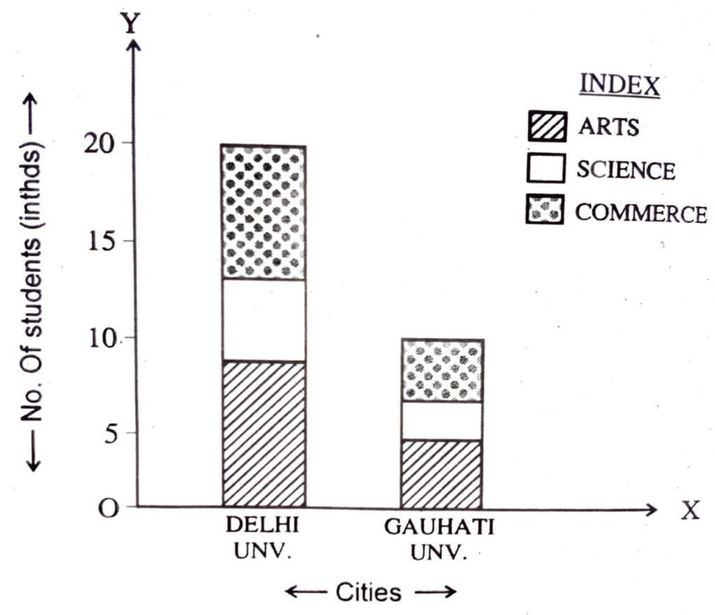
17. Draw a sub divided bar diagram for the following data-
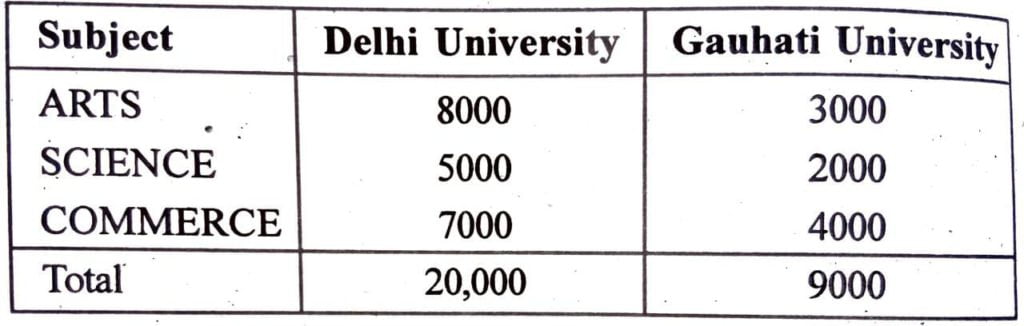
Ans: Given data is presented by the following sub divided bar diagram
18. What do you meant by one variable time series graph ?
Ans: It represent only one value with its respective time. It is drawn with absolute values on natural scale, taking time on x-axis and the other variable on y-axis.
19. What do you meant by two or more variable time series graphs ?
Ans: Time series data relating to two or more related variable i.e.. Two pendent variables relating to same time period can be depicted together along the same time period, using the same scale, with two or more variable time series graphs. For example, the data relating yield and sales in million ons during different years can be shown in a single graph as that histogram of one variable. However, we will draw two different lines distinguish from each other one in dotted line and the other as thick line.
20. What do you mean by graphs of frequency distribution ?
Ans: Frequency graphs are designed to reveal clearly the characteristic features of a frequency distribution. They make the particular features of the statistical series prominent and help in understanding them move quickly and easily. It simply depicts the discrete and continuous frequency distribution. Some of the most important graphs for charting the frequency distribution are -histograms, frequency polygon, frequency curves, ogive etc.
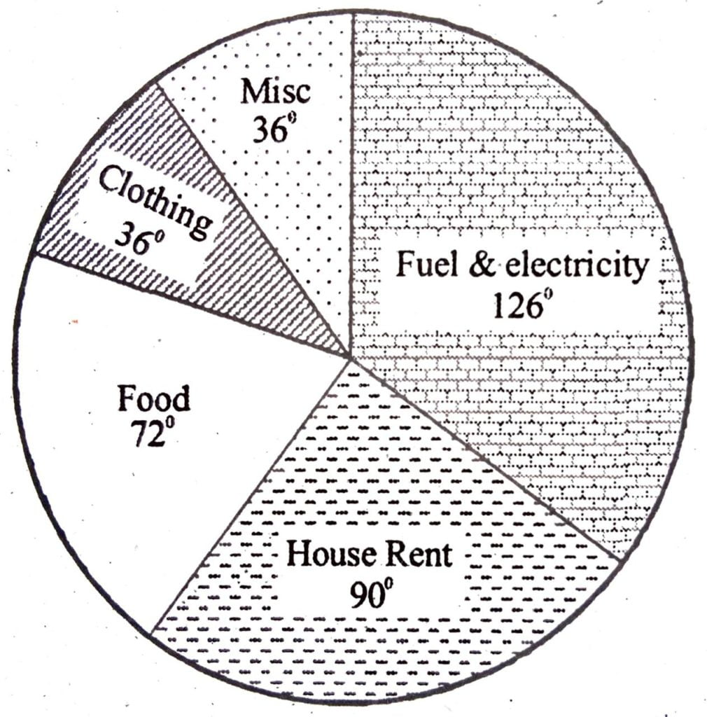
21. Show the following data by means of pie diagram.
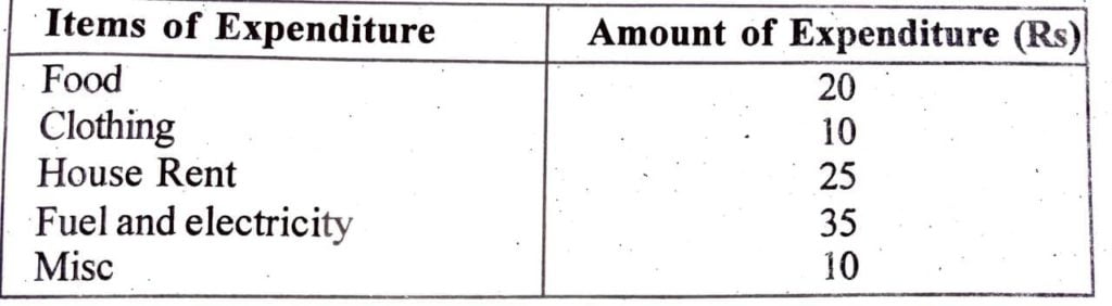
Ans: For calculation we make the following table-
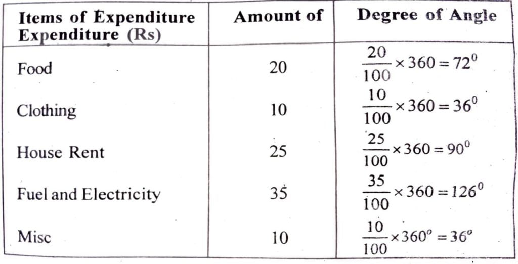
For calculation we make the following table-
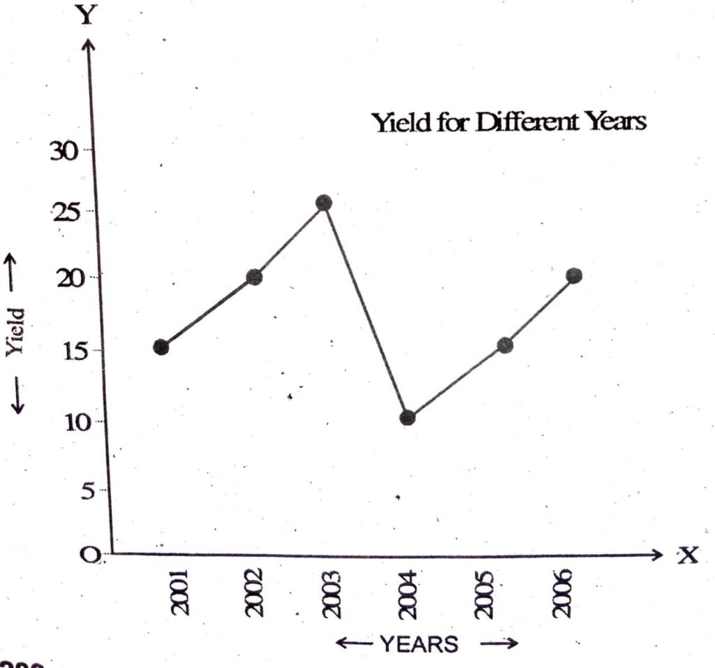
22. Represent the following in a time series graphs.
Year : 2001 2002 2003 2004 2005 2006
Yield : 15 18 24 10 12 15 (in metric tons)
Ans: Taking scale one year=one centimetre on x axis and 5 metric ton = 1 cm on y-axis, the required graph is drawn below-
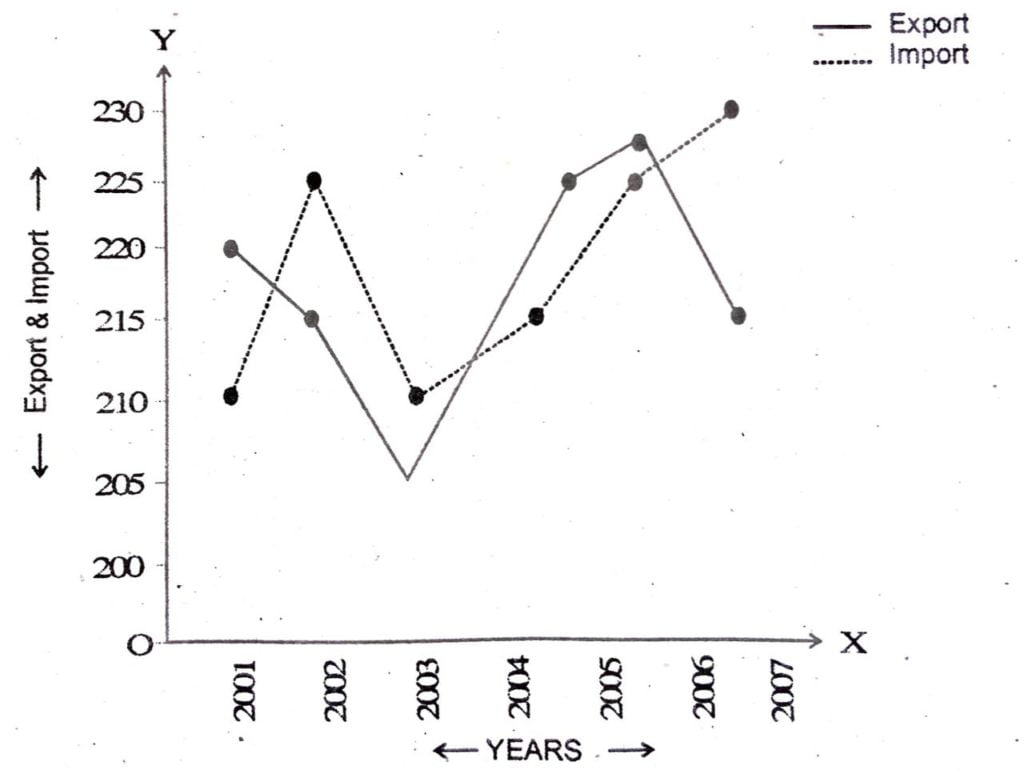
23. Prepare a graph for the following data relating exports and imports. imports.
| Year: | 2001 | 2002 | 2003 | 2004 | 2005 | 2006 |
| Export: (in Million Rs) | 220 | 215 | 205 | 225 | 228 | 216 |
| Imports: (in Million Rs) | 210 | 225 | 210 | 215 | 225 | 228 |
Ans: The required graph is drawn below –
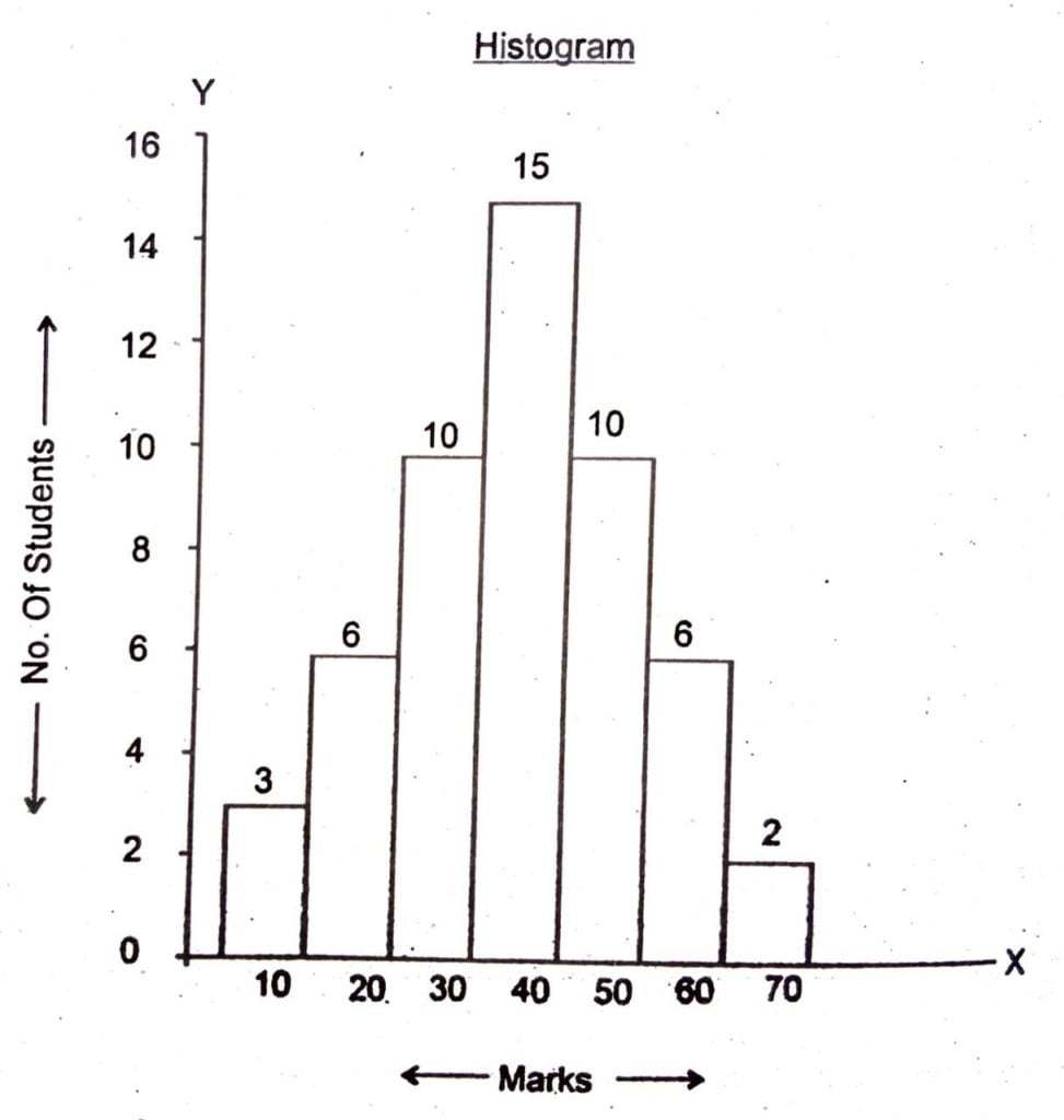
24. Depict the following frequency distribution through histogram.
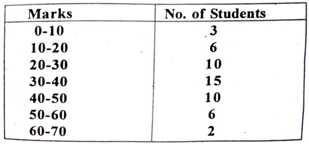
Ans: Scale 10 Marks = 1cm on X-axis and 5 no. of students = 1 cm on Y-axis.
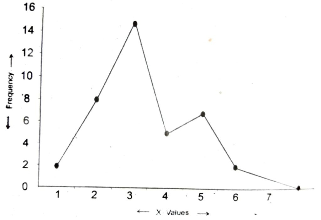
25. Draw a frequency polygon for the following data-
| X: | 1 | 2 | 3 | 4 | 5 | 6 | 7 |
| F: | 2 | 8 | 15 | 5 | 7 | 2 | 1 |
Ans: Scale: X-axis 10=1 cm.
Y-axis 20= 1 cm.
26. From the following data construct – Histogram and Polygon
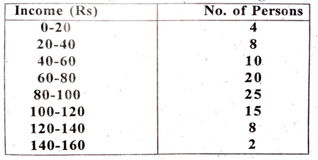
Ans:
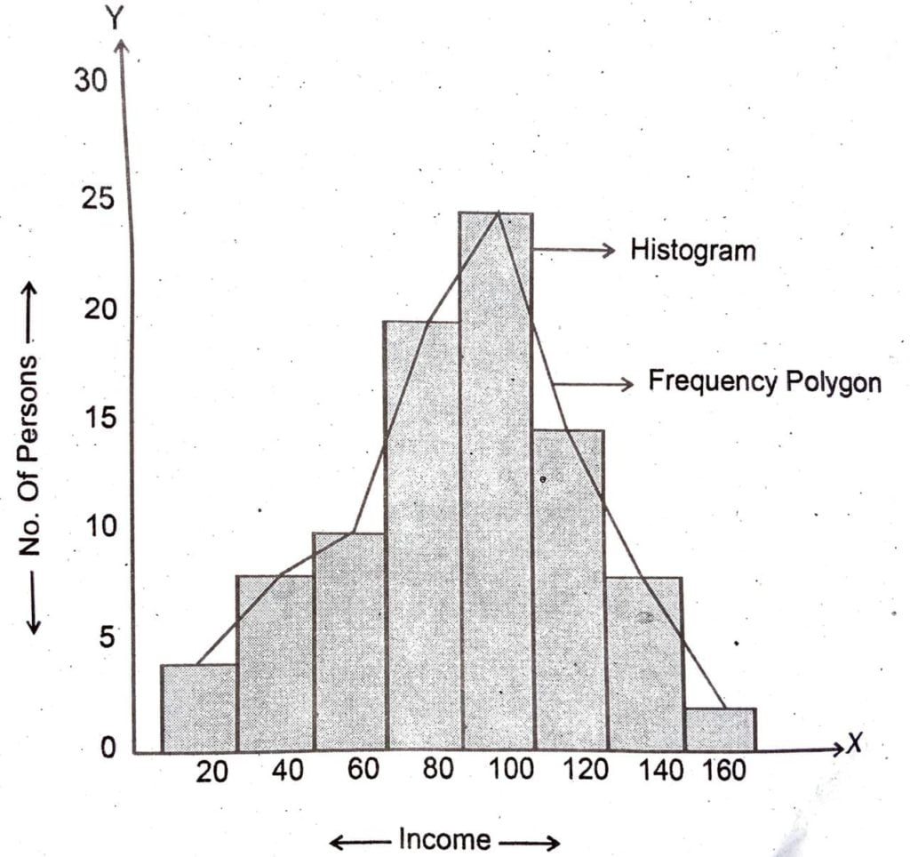
Scale: X-axis 20=1cm.
Y-axis 2 = 1 cm.
Frequency polygon is drawn by finding aut the mid points of intervals (in this case income) and then by plotting them in right positions.
27. From the following information construct, less than and more than ogive.
| Wages (Rs): | 0-30 | 30-40 | 40-50 | 50-60 | 60-70 | 70-100 |
| No. of Works: | 10 | 15 | 30 | 32 | 8 | 5 |
Ans: For calculation we make the following table –
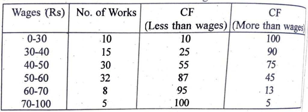
Here cf= Cumulative frequency.
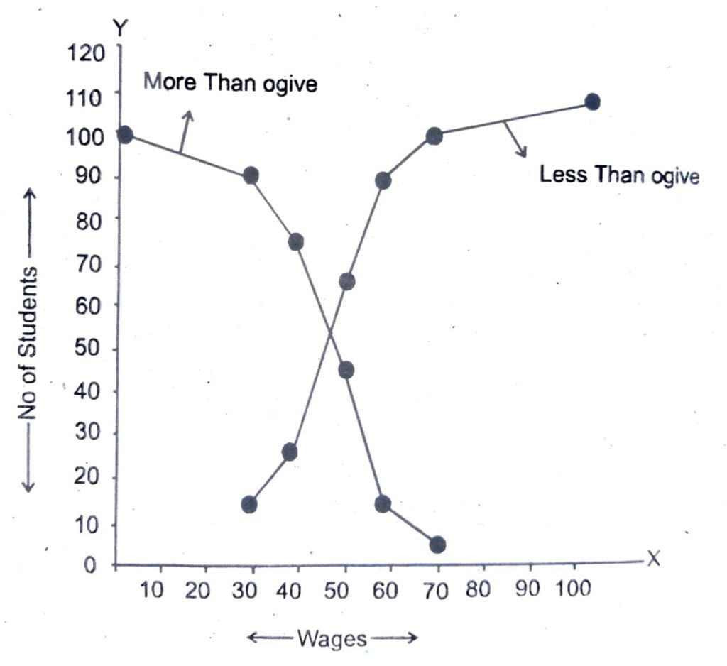
Scale: X- axis 10= 1 cm
Y- axis 10= 1 cm.

Hi, I’m Dev Kirtonia, Founder & CEO of Dev Library. A website that provides all SCERT, NCERT 3 to 12, and BA, B.com, B.Sc, and Computer Science with Post Graduate Notes & Suggestions, Novel, eBooks, Biography, Quotes, Study Materials, and more.