NIOS Class 12 Home Science Chapter 34 Colour Solutions to each chapter is provided in the list so that you can easily browse throughout different chapters NIOS Class 12 Home Science Chapter 34 Colour and select need one. NIOS Class 12 Home Science Chapter 34 Colour Question Answers Download PDF. NIOS Study Material of Class 12 Home Science Notes Paper 321.
NIOS Class 12 Home Science Chapter 34 Colour


Also, you can read the NIOS book online in these sections Solutions by Expert Teachers as per National Institute of Open Schooling (NIOS) Book guidelines. These solutions are part of NIOS All Subject Solutions. Here we have given NIOS Class 12 Home Science Chapter 34 Colour, NIOS Senior Secondary Course Home Science Solutions for All Chapter, You can practice these here.
Colour
Chapter: 34
MODULE – VI (B): CREATIVE HAND EMBROIDERY
TEXTUAL QUESTIONS
INTEXT QUESTIONS 30.1
Q. 1. Fill in the blanks:
1. Red, __________ and __________ are primary colours.
Ans: yellow, blue.
2. Brown, beige and tan are __________ colours.
Ans: neutral
3. Tertiary colours are obtained by mixing one __________ and one __________ colour.
Ans: primary, secondary.
4. __________ colours form effective background for dark colours.
Ans: neutral.
5. Orange colour can give you a feeling of __________ during winters.
Ans: warmth.
Q. 2. Complete the equation:
1. Red + Blue = ____________.
Ans: Purple.
2. Yellow + ____________ = Yellow orange.
Ans: Orange.
3. ____________ + Green = Blue green.
Ans: Blue.
INTEXT QUESTIONS 30.2
Q. 1. Give one word for the following:
1. Brightness or dullness of colour. ____________
Ans: intensity.
2. Lightness or darkness of colour. ____________
Ans: value.
3. Technical name of the colour. ____________
Ans: hue.
4. A lighter colour. ____________
Ans: tint.
5. A darker colour. ____________
Ans: shade/tone.
INTEXT QUESTIONS 30.3
Q. 1. State whether the following statements are true or false.
1. Monochromatic colour scheme consists of tints and shades of the same colour.
Ans: True.
2. Red, blue-green and yellow-green form a tetrad colour scheme.
Ans: False.
3. Colours that are opposite each other in the colour wheel are known as complementary colours.
Ans: True.
4. Split complementary colour scheme is placed equilaterally on the colour wheel.
Ans: False.
5. Analogous is also known as adjacent colour scheme.
Ans: True.
Q. 2. Match the statements in Column A with those in Column B.
| Column A | Column B |
| 1. Yellow and purple | (a) Split complementary colours |
| 2. Yellow, red-purple, blue-purple | (b) Triad colour scheme |
| 3. Red, yellow, blue | (c) Tetrad colour scheme |
| 4. Green, yellow-orange, red, blue- purple | (d) Complementary colours |
| (e) Monochromatic colour scheme |
Ans:
| Column A | Column B |
| 1. Yellow and purple | (d) Complementary colours |
| 2. Yellow, red-purple, blue-purple | (a) Split complementary colours |
| 3. Red, yellow, blue | (b) Triad colour scheme |
| 4. Green, yellow-orange, red, blue-purple | (c) Tetrad colour scheme |
INTEXT QUESTIONS 30.4
Indicate the colours you think are most suitable for the following:
(i) wedding dress of a bride in your area.
Ans: red/white.
(ii) a girl’s frock.
Ans: pink.
(iii) salwar kurta worn in summer.
Ans: yellow/green/blue.
(iv) gents’ kurta worn in winter.
Ans: brown/grey.
(v) curtains in children’s room.
Ans: orange/ yellow.
(vi) bed cover in bedroom.
Ans: blue.
(vii) king’s dress for a child’s fancy dress show
Ans: purple/gold.
TERMINAL QUESTIONS
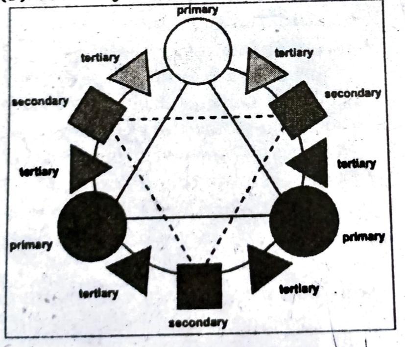
Q. 1. What are related colour schemes? Explain with the help of a colour wheel.
Ans: By understanding and using a colour wheel you can create exciting colour schemes easily.
Colour Wheel
A colour wheel (also referred to as a colour circle) is a visual representation of colours arranged according to their chromatic relationship. Begin a colour wheel by positioning primary hues equidistant from one another, then create a bridge between primaries using secondary and tertiary colours.
These terms refer to colour groups or types:
Primary Colours: Colours at their basic essence; those colors that cannot be created by mixing others.
Secondary Colours: Those colours achieved by a mixture of two primaries.
Tertiary Colours: Those colours achieved by a mixture of primary and secondary hues.
Basic Colour Combinations on a Colour Wheel are:
• Monochromatic
Analogous: Red and Orange, Blue and Green, etc. These are colours right next to each other on the colour wheel. They usually match extremely well, but they also create almost no contrast.
Complementary: Red and Green, Blue and Orange, Purple and Yellow. These are the colours directly across from each other on the color wheel. However they rarely look good when used together. They’re called “complementary” because, when used together, they become vibrant and have heavy contrast. Complementary colours are useful when you want to make something stand out. For example, if you use a green background and have a red circle on it, the red will jump off the page and be almost blinding. If you need a complementary colour to enliven a colour scheme, the colour wheel can help you do that. For example, you could use small ‘sparks’ of red-orange in a colour scheme that contains a lot of blue and turquoise.
• Triad.
• Split Complementary.
Step 1-begin by choosing a “mother colour”.
Step 2-Using your “mother colour” as a starting point on the Colour Wheel; you’ll select and apply one of these Colour Palettes. This will give you the root Hues to work from.
Step 3-with the right combination you can then adjust the root Hues by making them lighter, darker and more or less intense. For example A basic colour wheel can also give ideas for combining hues from the same colour family (like bluish and yellowish greens, reddish and bluish purples…).
Q. 2. List the various factors influencing the choice of colours. Explain giving examples.
Ans: The most important aspect of colour in daily life involves aesthetic and psychological responses to color and influences art, fashion, commerce, and even physical and emotional sensations (People respond to different colours in different ways, and these responses take place, on emotional level. Colours are non-verbal communication. As you design embroidery it is helpful to keep in mind how the eye and the mind understand certain colours and the colour meanings attached with each colour. Colour scheme is a planned combination of colours. Factors influencing choice of colours:
(i) No two people see colour in exactly the same way; our eyes are all slightly different.
(ii) Different cultures create different ‘meanings’ for colours. These are traditions, not ‘the truth’. Nevertheless, your thoughts about a color do influence your response to it. For example, many Asian cultures associate the colour white with death and mourning, while Christians in the West use it for wedding dresses.
(iii) We experience our lives ‘in colour’. Colours will, in turn, bring back personal memories and the feelings we associate with them (Grandfather’s garden, a trip to the seaside, a favorite dress…). When you’re looking to apply colour psychology to the interior design of your home, you could draw on these memories and experiences to create a feel-good home.
(iv) Colour by Gender-for example gender difference is seen in the choice of yellow being preferred to orange by women and orange to yellow by men.
(v) Favourite Colour by Age Group-for example, is well liked by children, but begins to drop away by people as they become adults; With maturity comes a greater liking for hues of shorter wave length (blue, green, purple) than for hues of longer wave length (red, orange, and yellow).
(vi) Factors like mental health mood. age, occasion, season, type of clothing all affect the use of colours.
Q. 3. List the similarities and differences between complementary and split complementary colour scheme.
Ans: Complementary colours are colours that are opposite each other on the colour wheel, such as blue and orange, red and green, purple and yellow. Complementary colours balance as they are opposites-one warm, one cool. The high contrast between the colours creates a vibrant look, especially when used at full saturation. Complementary colours can be tricky to use in large doses.
Split-complementary color scheme: It is a colour scheme that includes a main colour and the two colours on each side of its complementary (opposite) colour on the colour wheel.
Q. 4. Consider the given situation then answer the following questions:
Situation: a middle-aged man is wearing a navy blue three piece suit for an evening party.
(a) Name two different colours of the shirt in monochromatic colour scheme and analogous colour scheme.
(b) Name the complementary colour for tie and pocket-handkerchief.
Ans: 4a-Monchromatics: using one colour family in various values of intensities.
4b-Analogous: neighboring families on the colour wheel. Colour close to blue is blue-green, and green.
4c-Complementary: colours directly opposite each other on the colour wheel; thus in this case the colour of the tie and hanky for blue would be orange.
Creating Tints and Shades
Tint
Adding white to a colour is known as a Tint
Shade
Adding black is referred to as a Shade
Q. 5. What is the relationship between primary, secondary and teritary colours? Using a colour wheel, show how tertiary colours are prepared.
Ans: The most widely used basic colour wheel starts with three primary colours: yellow, red, and blue. These three are taken as the starting point for mixing all other colours. Together they produce a neutral colour, usually a murky gray.
Primary Colours: Red, yellow, blue are. primary colours. When mixing these three colour hues, at least in theory, all the other hues of the colour wheel, including black can be created. Primaries express fundamental qualities, folk art, embroidery, costumes, etc.
Secondary Colours: Orange, green and purple, made from mixing the primaries: red and yellow make orange, blue and yellow make green, and red and blue make purple. These secondary colours are also known as complementary colours. These colours always go well with each other, hence the term complementary.
red+green = yellow
green + blue = cyan
red+blue = magenta or purple
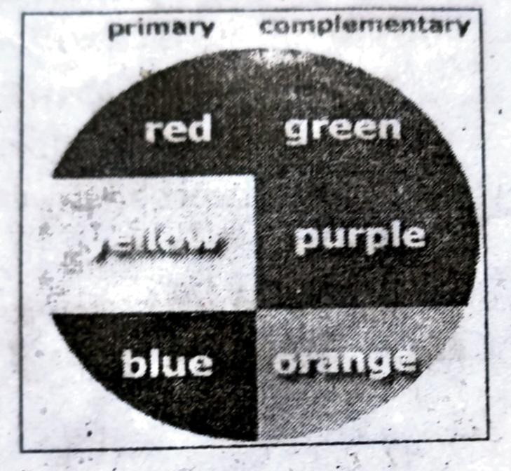
Tertiary Colours: These colours are created when mixing one-secondary and one primary colour i.e. blue + violet = blue-violet. Three or more separate colours are mixed (one primary and one secondary – the combination of two primaries), and in our colour wheel each tertiary colour being created will be an equal combination of the two colours, left and right, surrounding an open segment. The tertiary colours are yellow-orange, red-orange, red-violet, blue violet, blue-green, and yellow-green.
red + yellow = orange
red + magenta = purplish red
green + yellow = yellowish green
green + cyan = blueish green
blue + cyan = greenish
blue + magenta = purplish blue
Primary, Secondary, Tertiary Colours:
Primary Colours reds, greens and blues.
Secondary Colours yellows, violets (purples) and oranges.
Tertiary Colours Blends of the primary and secondary categories.
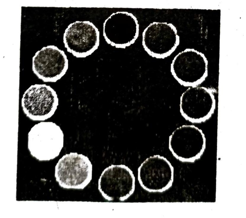
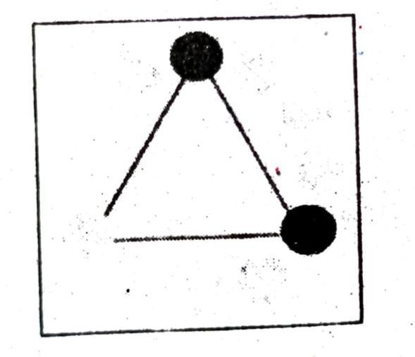
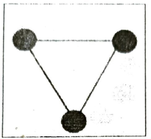
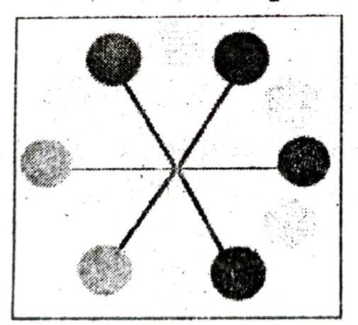
Q. 6. In a square of size 8 by 8 inches draw a composition of different geometrical shapes. Now colour the design in:
(a) Primary colours.
Ans: Primary colours:
(b) Tertiary colours.
Ans: Tertiary colours:

Hi! my Name is Parimal Roy. I have completed my Bachelor’s degree in Philosophy (B.A.) from Silapathar General College. Currently, I am working as an HR Manager at Dev Library. It is a website that provides study materials for students from Class 3 to 12, including SCERT and NCERT notes. It also offers resources for BA, B.Com, B.Sc, and Computer Science, along with postgraduate notes. Besides study materials, the website has novels, eBooks, health and finance articles, biographies, quotes, and more.