
NIOS Class 12 Economics Chapter 7 Presentation of Data, Solutions to each chapter is provided in the list so that you can easily browse through different chapters NIOS Class 12 Economics Chapter 7 Presentation of Data and select need one. NIOS Class 12 Economics Chapter 7 Presentation of Data Question Answers Download PDF. NIOS Study Material of Class 12 Economics Notes Paper 318.
NIOS Class 12 Economics Chapter 7 Presentation of Data


Also, you can read the NIOS book online in these sections Solutions by Expert Teachers as per National Institute of Open Schooling (NIOS) Book guidelines. These solutions are part of NIOS All Subject Solutions. Here we have given NIOS Class 12 Economics Chapter 6 Collection And Classification of Data, NIOS Senior Secondary Course Economics Solutions for All Chapters, You can practice these here.
Presentation of Data
Chapter: 7
Module – III: Introduction to Statistics
TEXT BOOK QUESTIONS WITH ANSWERS
INTEXT QUESTIONS 7.1.
Q.1. State whether the following statements are true or false:
(a) Satisfactory collection of data must be followed by its good presentation.
Ans. True.
(b) Tabulation is the only way of presenting data.
Ans. False.
(c) Tables help in intelligent use of statistical data.
Ans. True
(d) The title of a table should be brief and to the point.
Ans. True
Q.2. Fill in the blanks using suitable word given in the bracket.
(a) A ________ is a systematic arrangement of statistical data in columns and rows. (table, graph)
Ans. Table.
(b) Head note is written below the ________ of the table. (title, footnote)
Ans. Title.
(c) The _______ consists of stub head and stub entries. (stub, note)
Ans. Stub.
(d) A foot-note is placed at the ________ of a table. (top, main body, bottom)
Ans. Bottom.
INTEXT QUESTIONS 7.2.
Q.1. State whether the following statements are true or false:
(a) The width of a bar diagram is important.
Ans. False.
(b) In bar diagram, height of bars shows the value of the variable.
Ans. True.
(c) We can have vertical as well as horizontal bars to present some data having one variable.
Ans. True.
(d) When a breakdown of data is to be represented we use multiple bar diagram.
Ans. False.
(2) Fill in the blanks with suitable words out of those given in the brackets:
(a) Apie-chart is also called _______ diagram. (a bar, an angular, a multiple bar)
Ans. An angular.
(b) Value of the group / Total of all group × 360° = _______ (area, radius, degree for a group).
Ans. Degree for a component/group.
Intext Questions 7.3
Q.1. Fill in the blanks:
(a) A _______ graph shows the relationship between two variables.
Ans. Line.
(b) If one of the variables on line graph is ________ it is called time series line graph.
Ans. Time.
(c) In a time series line graph ________ is an independent variable.
Ans. Time.
(d) In a time series line graph ________ variable is represented on the Y-axis.
Ans. Dependent.
Terminal Exercise
Q. 1. What is a statistical table? List its various types.
Ans. Meaning of a table: A table is a systematic arrangement of related statistical data in columns and rows with some predetermined aim or purpose. Rows are horizontal arrangement whereas columns are vertical ones. The purpose of a table is to simplify the presentation and to facilitate comparisons.
List of various types of table is as follows:
(i) Reference or general purpose tables.
(ii) Special purpose or text tables.
Q.2. What is the purpose of preparing a table? In this context distinguish between reference table and text-table.
Ans. Purpose of preparing a table: The purpose of preparing a table is to simplify presentation of related data and make comparisons easy. The readers can easily locate the desired information. For example, the purpose of the following table might be to show the imports and exports of a country ‘A’ vis-a-vis other countries B, C, D and E.
Table: Imports and Exports of Country ‘A’ during 2002-05
(Rs. Crores)
| S. No. | Country (1) | Imports (2) | Exports (3) |
| 1 | B | 70 | 73 |
| 2 | C | 72 | 80 |
| 3 | D | 74 | 85 |
| 4 | E | 85 | 80 |
From this table on exports and imports, the country which has highest exports can be easily located. The data given in rows is read from left to right. For example, row 1 shows that country A imports 70 from B and exports 73 to B. The data given in column B read from above to downwards. For example, column 2 shows that country A imports 70, 72, 74, 85 respectively from countries B, C, D and E.
Differences between reference-table and text-table:
(i) Reference or general purpose tables: These tables are in a way, a store of information with an aim of presenting detailed statistical material. From these tables we can derive smaller tables. Generally, statistical tables presented by Government of India and its various statistical agencies and departments are reference or general purpose tables.
(ii) Special purpose or text tables: These tables are smaller and can be obtained from reference tables. They aim to analyse a particular aspect so that we are able to bring out a specific point or answer a specific question.
Q.3. What is a bar chart? Explain briefly its various types.
Ans. A bar can be defined as a thick ‘line’, often made thicker to draw attention of the reader. The height of this bar shows the quantity of the variable we want to present. It is also called one dimensional diagram because only height of the bar is important and its base or width is not taken into account. To make them look more beautiful, bars are either coloured or shaded in different ways.
Types of bar charts: There are two types
of bar charts
(a) simple. and
(b) component.
(a) Simple Bar Charts: Simple bar charts can be
(i) Single bar charts. and
(ii) Multiple bar charts.
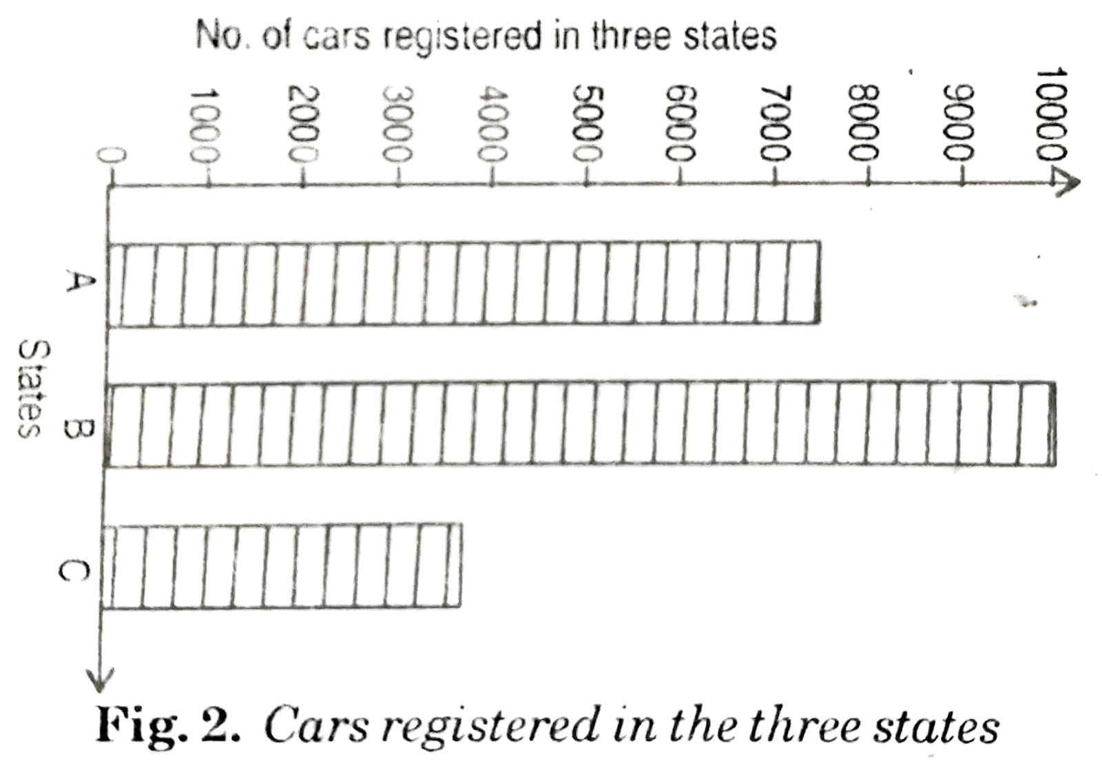
(i) Single bar charts: Vertical bars are shown in Fig. 1. and horizontal bars are shown in Fig. 2. Normally, vertical bars are often used. Let us now explain how a bar diagram can be prepared from given data in table:
Table: Number of cars registered in three states
| States | No. of Cars |
| A | 8,000 |
| B | 10,000 |
| C | 4,000 |
Single Bar Chart (vertical)
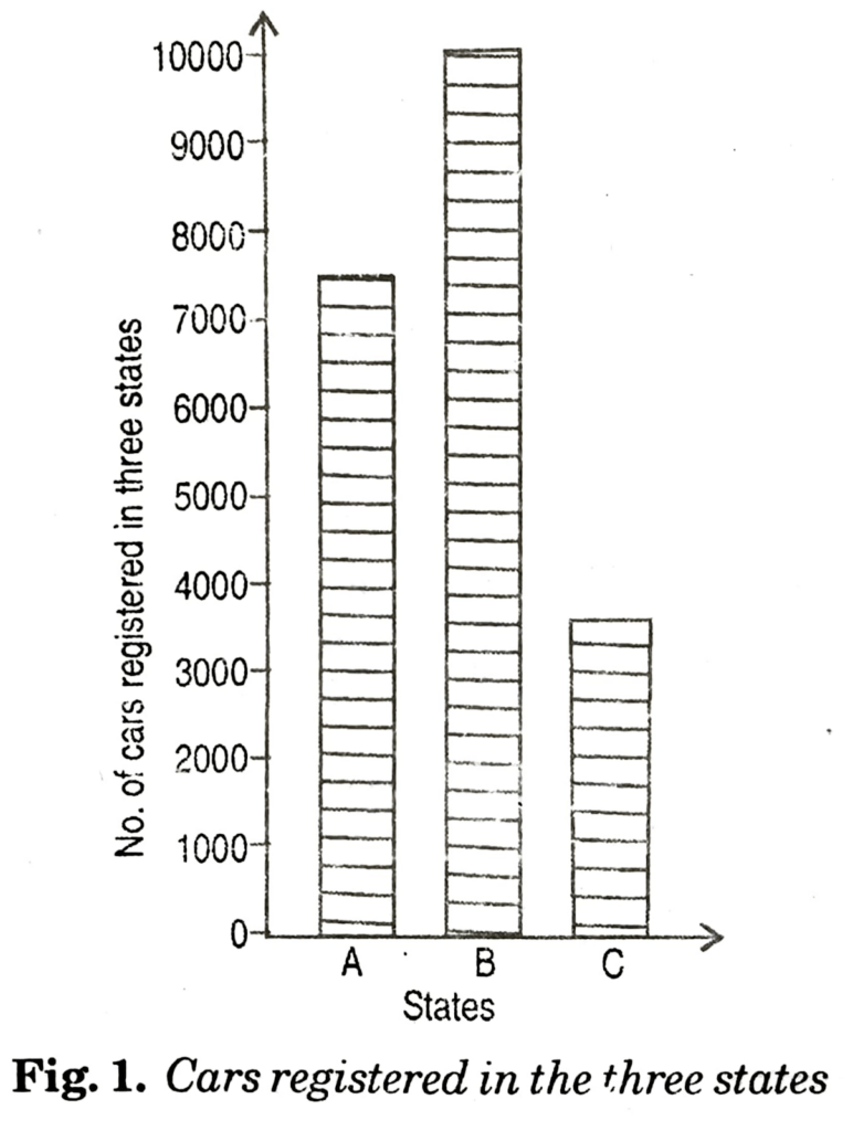
In the case of vertical bars, states are represented on X-axis and the number of cars on the Y-axis. As per the data given in table each bar (rectangle with the same base) is raised according to the value of the variable (here the number of cars registered). For example in Fig. 1, rectangle representing state A is raised upto 8,000, for State B upto 10,000 and for State C upto 4,000.
In case of horizontal bars, states are represented on Y-axis. Here the bars (rectangles) are drawn horizontally upto 8,000, 10,000 and 4,000 cars respectively for the three States A, B and C (Fig.2).
Single Bar Chart (Horizontal)
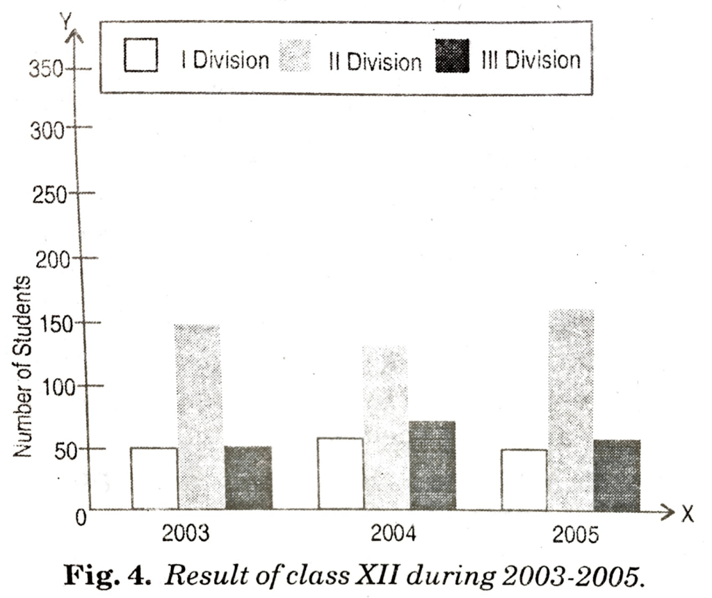
(ii) Multiple bar charts: Sometimes it is desired to represent more than one interrelated series data on a bar diagram. In such cases a simple bar diagram is not suitable. We have to use what is known as multiple bar diagram. Here the number of bars for each year or region or zone is equal to the number of variables (data) to be represented. For example, imports and exports will be represented by two bars; selling price, cost price and profits by three bars and so on. Normally we do not take more than three bars because it becomes complicated. The method of drawing bars is the same as explained for simple bar diagrams. Two examples of multiple bar diagrams are presented below (Fig.3. based on table and Fig. 4. based on table).
Table: Imports and Exports of Country ‘X’ during 2001 to 2005
(Rs. Crores)
| Year | Imports | Exports |
| 2001-02 | 2955 | 2523 |
| 2002-03 | 4519 | 3329 |
| 2003-04 | 5265 | 4049 |
| 2004-05 | 5265 | 5143 |
Multiple Bar Chart
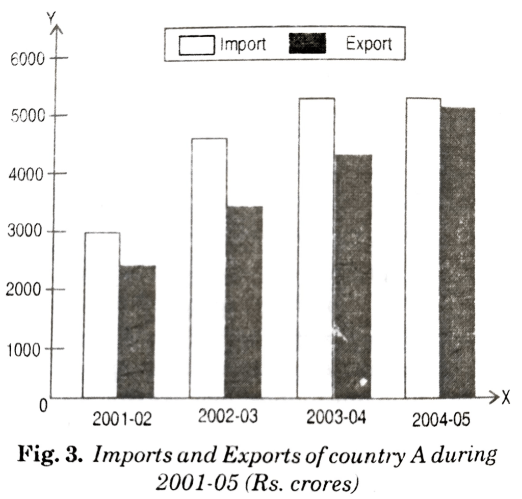
Table: Result of class XII during 2003-05
| Year | First Division | Second Division | Third Division |
| 2003 | 50 | 150 | 50 |
| 2004 | 60 | 140 | 70 |
| 2005 | 50 | 160 | 60 |
Multiple Bar Chart
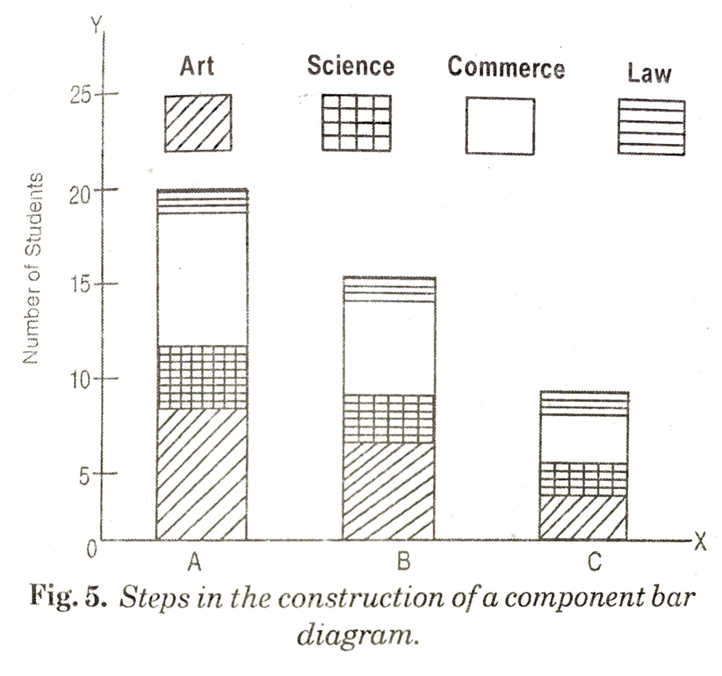
(b) Component Bar Chart: A simple bar diagram is used to present only one variable. But when a breakdown of total or a series of totals is to be represented, we have to use what is called subdivided or component bar diagrams. Here we use subdivided or component bar diagram as shown in Fig. 5. It is based on imaginary (or hypothetical) data shown in table.
Table: No. of students appearing in examination
| Stream | University A | University B | University C |
| Arts | 8,000 | 6,000 | 3,000 |
| Science | 4,000 | 2,000 | 1,000 |
| Commerce | 7,000 | 5,000 | 4,000 |
| Law | 1,000 | 2,000 | 2,000 |
| Total | 20,000 | 15,000 | 10,000 |
Step 1. The order of various components in different bars should be same so as to facilitate comparison.
Step 2. The number of components in a bar, in no case should exceed 10.
Step 3. Index or key showing various components must be shown through different shades or colours.
Number of students appearing in examinations in various universities
Q.4. What is difference between simple bar diagram, subdivided or component bar diagram and multiple bar diagram?
Ans. Simple bar diagrams: They are very simple to present but only one type of variable can be presented. A simple bar diagram can be drawn either on horizontal or vertical base, but bars on horizontal, (showing vertical bars) are more common. It is used to represent one variable, e.g. students, prices, production, population, sales, etc. This diagram can present any type of information of one category either in years, months, weeks, etc. or relating to different places, sections or groups.
Subdivided or component bar diagrams: These diagrams show the total of values and its break-up into parts. The bar is subdivided into various parts in proportion to the values given in the data and a bar as such represents the total. These diagrams are also called component bar diagram. We can use different colours like black, green, red or different shades of colour to distinguish subdivision of a bar. It should be kept in mind that the various components should be kept in the same order in each bar.
Multiple bar diagrams: Such diagrams are used when a comparison is to be made between two or more variables. The multiple bar diagram represents two or more sets or interrelated data. Separate bars are drawn for each value. We can complete one variable over different years and different variables at the same time using different colours or shades to these variables.
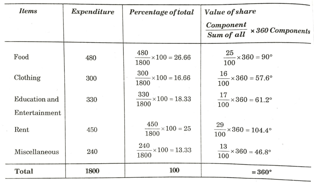
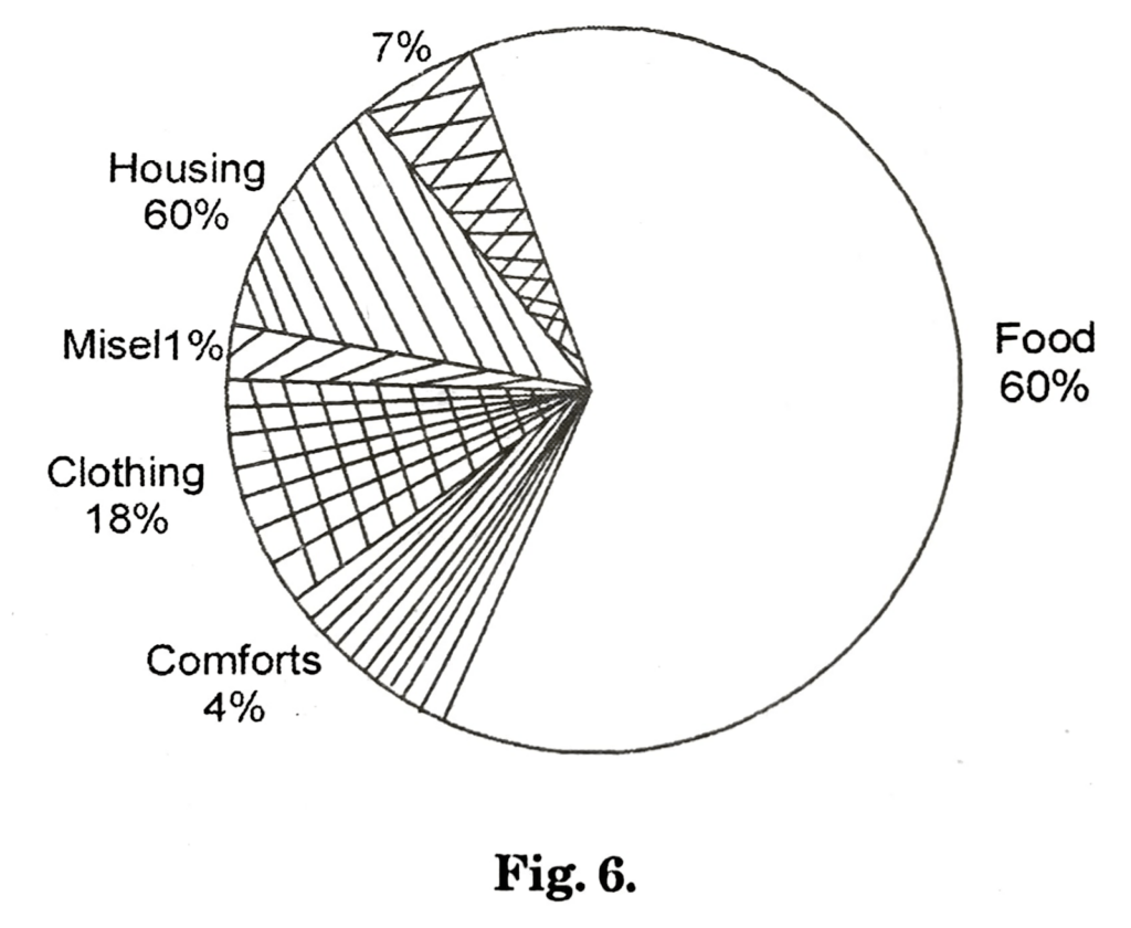
Q.5. Explain the meaning and uses of a pie diagram. Prepare a pie diagram of family expenditure from the following data:
| S. No. | Items | Expenditure (Rs.) |
| 1 | Food | 480 |
| 2 | Clothing | 300 |
| 3 | Education and Entertainment | 330 |
| 4 | Rent | 450 |
| 5 | Miscellaneous | 240 |
| Total Expenditure | 1800 |
Ans. Pie diagram: It is also known as angular diagram. Pie diagrams are more popularly used for presenting percentage breakdown of data. For example, students of a particular college may be put in three categories Science students, Commerce students and Arts students. The pie diagram can be effectively used to show these categories or breakdowns. A pie diagram, therefore, is a circle divided into component sectors to present the proportion of different constituent parts to the total. As such a pie diagram is shown in percentage terms. A very common use of this diagram is to represent:
(i) A monthly family budget and its different portions to budget allotted to rent, food, education, clothing, etc.
(ii) Government of India’s budget and its different portions such as agriculture, industries, education, health, irrigation, etc.
Table: Monthly Budget of a Family
Q.6. Explain the meaning of time series line graph with the help of an example.
Ans. The statistical data can be represented in the form of line graphs. A line graph records the relationship between two variables. If one of the two variable is five days, weeks, months or years, we get a time series line graph. For example, let us draw a line graph on the basis of the following data on production of steel in country ‘X’ from 2000-01 to 2005-06.
Table: Production of Steel in Country ‘X’
| Year | Production (in million tonnes) |
| 2000 – 01 | 106 |
| 2001 – 02 | 162 |
| 2002 – 03 | 211 |
| 2003 – 04 | 260 |
| 2004 – 05 | 290 |
| 2005 – 06 | 302 |
The graph given below is a time series line graph. In this graph time is represented on the x-axis
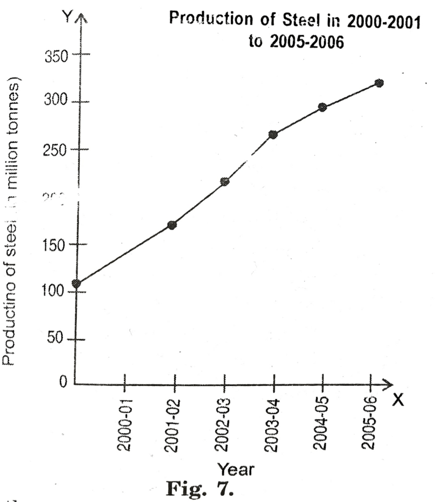
and the production on y-axis. We know that production will change with time. In other words as time passes production is affected and it increases or decreases or may remain constant. Since production changes with time, it is said to be dependent on time. Production is therefore, treated as a dependent variable. Time is not influenced by production and therefore, taken as an independent variable.
Point A on the line graph (also called curve) shows that production of steel in country ‘X’ in the year 2000-01 was 106 million tonnes. Similarly, points B, C, D, E and F show production levels in the subsequent years. The upward rising of the curve from left to right indicates that production of steel in country ‘X’ is constantly rising since 2000-01.
Table: Exports and Imports of India.
| Year | Imports (in Rs. 100 crores) | Exports (in Rs. 100 crores) |
| 2000 – 01 | 65 | 125 |
| 2001 – 02 | 78 | 138 |
| 2002 – 03 | 88 | 143 |
| 2003 – 04 | 97 | 158 |
| 2004 – 05 | 119 | 172 |
| 2005 – 06 | 110 | 198 |
The time series line graph prepared on the basis of above data is given below:
In the above graph exports are shown in broken line and imports otherwise. Such a presentation is very useful to make comparison between two dependent variables.
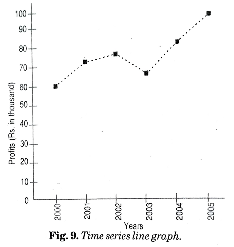
Q.7. Draw a time series line graph on the basis of following data:
Annual Profits of A Firm
| Year | Profit (Rs. in thousand) |
| 2000 | 60 |
| 2001 | 72 |
| 2002 | 75 |
| 2003 | 65 |
| 2004 | 80 |
| 2005 | 95 |
Ans:

Hi! my Name is Parimal Roy. I have completed my Bachelor’s degree in Philosophy (B.A.) from Silapathar General College. Currently, I am working as an HR Manager at Dev Library. It is a website that provides study materials for students from Class 3 to 12, including SCERT and NCERT notes. It also offers resources for BA, B.Com, B.Sc, and Computer Science, along with postgraduate notes. Besides study materials, the website has novels, eBooks, health and finance articles, biographies, quotes, and more.