
NIOS Class 12 Data Entry Operations Chapter 8 Formulas, Functions And Charts Solutions to each chapter is provided in the list so that you can easily browse throughout different chapters NIOS Class 12 Data Entry Operations Chapter 8 Formulas, Functions And Charts and select need one. NIOS Class 12 Data Entry Operations Chapter 8 Formulas, Functions And Charts Question Answers Download PDF. NIOS Study Material of Class 12 Data Entry Operations Notes Paper 336.
NIOS Class 12 Data Entry Operations Chapter 8 Formulas, Functions And Charts


Also, you can read the NIOS book online in these sections Solutions by Expert Teachers as per National Institute of Open Schooling (NIOS) Book guidelines. These solutions are part of NIOS All Subject Solutions. Here we have given NIOS Class 12 Data Entry Operations Chapter 8 Formulas, Functions And Charts, NIOS Senior Secondary Course Data Entry Operations Solutions for All Chapter, You can practice these here.
Formulas, Functions And Charts
Chapter: 8
DATA ENTRY OPERATIONS
INTEXT QUESTIONS
1. Write True or False for the following statements:
(a) Format picture displays all the images properties in a separate window.
Ans. True.
(b) Activate the image you wish to edit by clicking on it once with the mouse.
Ans. True.
(c) Line charts show the proportion of each component value to the total value in a data series.
Ans. False.
(d) Pie charts are useful to compare the trends over time.
Ans. False.
2. Fill in the blanks:
(a) Each auto shape can be rotated by first
clicking _____________ button on the drawing tool bar.
Ans. free rotate.
(b) More _____________ effects can be changed using the picture toolbar.
Ans. picture.
(c) _____________ displays all the image properties in a separate window.
Ans. format picture.
(d) _____________ show the relative contributions that each data series takes up.
Ans. Area charts.
(e) You have to enter the name of the chart and titles for ___________.
Ans. X, Y axes.
TERMINAL QUESTIONS
1. What is the importance of charts and graphics in providing information?
Ans. Charts: Charts allow we to present data entered into the worksheet in a visual format using a variety of graph types. Before we can make a chart, we must first enter data into a worksheet. This section explains how we can create simple charts from the data. Formatted charts come in various types for diverse goals, ranging from columns to pics, from lines to surfaces etc.
Graphics: Visual representation of information and ideas is called SmartArt Graphics. They can be used to quickly, easily and effectively communicate a message. The facility to create a Smart Art Graphic is available in MS Excel 2007. We can copy and paste SmartArt graphics as images into other programs such as Word and Power Point.
2. Briefly explain any five different components of a chart?
Ans. Five different components of a chart are given below:
(i) Chart Title: A title given to the whole chart.
(ii) X-Axis Title: A title given to the X-Axis data range.
(iii) Y-Axis Title: A title given to the Y-axis data range.
(iv) X-Axis Category: These are the categories of the data which have been plotted. These are taken from the first column or first row of our data range.
(v) Y-Axis Value: This is the data range marked to plot the data series.
3. Explain the process of creating a chart using Chart Wizard dialog box.
Ans. Chart Wizard: The Chart wizard guides we through the process of doing a mail merge. This involves creating and editing main document; creating a new data file opening an existing data file and merging the data fields with main document. To use mail Merge Wizard. Select Mailings→Start Mail Merge Subtask from the main tab bar. Then select Step by step Mail Merge Wizard Option on the subtask bar.
The Mail Merge Wizard menu will appear on the screen. This will help we to create mail merge documents in customised step manner. The Wizard has six steps to create a mail merge document.
4. Briefly explain the following:
(a) Bar charts.
Ans. Bar charts: Bar charts are used to show comparisons between individual items. To make a bar chart the data should be arranged in the form of rows and columns on a worksheet.
(b) Pic charts.
Ans. Pie charts: In a situation where one has to show the relative proportions or contributions to a whole, a pie chart is very useful. In case of pic chart only one data series is used. Small number of data points add more to the effectiveness of pic charts.
5. List any four features of Chart Formatting toolbar.
Ans. (i) Format button.
(ii) Legend toggle.
(iii) Chart type.
(iv) Data table vies.
6. How do you copy a chart to Word created in Excel 2007?
Ans. Copying the Chart to Microsoft Word:
A finished chart can be copied into a Microsoft Word document or power point slide. Select the chart and click Copy. Open the destination document in Word or a slide in power point and click paste.
7. List any five categories of Autos hapes in Excel.
Ans. (i) Connectors: Lines can be used to connect flow chart elements.
(ii) Block Arrows: Select Block Arrows to choose from many types of two and three dimensional arrows. Drag and drop the arrow in the worksheet and use the open box and yellow diamond handles to adjust the arrowheads.
(iii) Flow Chart: Choose from the flow chart menu to add flow chart elements to the worksheet and use the lines menu to draw connections between the elements. We have drawn a flow chart using lines, flow chart elements and connectors.
(iv) Stars and Banners: Click the button to select stars, bursts, banners and scrolls.
(v) Call Outs: Select from the speech and though bubbles and line call outs. Enter the call out text in the text box that is made.
8. You are asked to prepare a flow chart. What kind of Autos hapes you would like to use?
Ans. Choose from the flow chart menu to add flow chart elements to the worksheet and use the lines menu to draw connections between the elements. We have drawn a flow chart using lines, flow chart elements and connectors.
9. Explain the steps in adding a Clip Art to your worksheet?
Ans. Adding Clip Art: Clip is a single media file, including sound, animation, art or movie.
Steps to insert a Clip Art:
(i) Click on Insert Tab.
(ii) From Illustrations Group, Click on Clip Art.
(iii) Then Select a Collection and press Go Button.
(iv) Click on a clip from the collection.
10. How do you add a photo or graphic to your worksheet from existing file?
Ans. Inserting and Editing a Picture from a File: Follow these steps to add a picture, photo or graphic from an existing file:
(i) Click on Insert Tab.
(ii) From Illustrations Group, Click picture.
(iii) Now select a picture from the location of the picture (where you have stored the picture) and enter or click on insert button.
(iv) The picture is added on the excel sheet. Click on the picture to activate Format tab as shown below along with its ribbon showing groups like Adjust, Picture Styles, Arrange and Size. Use any of the groups to make necessary changes in the picture appearance.
11. What is the main differences between:
(a) a column chart.
Ans. Column Chart: This type of chart is used to compare values across categories. They give very effective results to analyze the data of the same category on a defined scale.
(b) a bar chart.
Ans. Bar charts: Bar charts are used to show comparisons between individual items. To make a bar chart the data should be arranged in the form of rows and columns on a worksheet.,
12. Write a note on Smart Art.
Ans. Visual representation of information and ideas is called SmartArt Graphics. They can be used to quickly, easily and effectively communicate a message. The facility to create a Smart Art Graphic is available in MS Excel 2007. We can copy and paste SmartArt graphics as images into other graphics as images into other programs such as Word and PowerPoint.
OTHER IMPORTANT QUESTIONS AND ANSWERS
Q. 1. Differentiate between the Chart and Pivot table.
Ans. Charts: It will help you in presenting a graphical representation of your data in the form of Pie, Bar, Line charts and more.
Pivot Table: It flips and sums data in seconds and allows you to perform data analysis and generating reports like periodic financial statistical reports, etc. You can also analyse complex data relationships graphically.
Q. 2. Define the term Bar chart.
Ans. Bar Chart: Bar charts are used to show comparisons between individual items. To make a bar chart the data should be arranged in the form of rows and columns on a worksheet.
Q. 3. Write short notes on the Pie chart.
Ans. Pie Chart: It is also called a circular chart. In a situation where one has to show the relative proportions or contributions to a whole, a pie chart is very useful. In case of pie chart only one data series is used. Small number of data points in a situation where one has to show the relative proportions or contributions to a whole, a pie chart is very useful. In case of pie chart only one data series is used.
Q. 4. Explain the purpose of the following functions with example: COUNTIF and SUMIF.
Ans. SUMIF (range, criteria, sum, range): This form of sum function is used to add the cells with respective to a given criteria.
COUNTIF (range, criteria): Counts the number of cells within a range that meet the given condition.
Q. 5. Following are a few examples of formulas:
| A | B | C | D | E | |
| 1 | 50 | 40 | 90 | 90 | |
| 2 | 20 | 80 | |||
| 3 | 30 | 60 | |||
| 4 | 40 | 30 |
Required:
(a) What would be displayed in the cell C1, if it contains the formula ” = A1 + Bl”?
Ans. 90
(b) What would be displayed in the cell D1, if it contains the formula “= Sum (A1: BI)”?
Ans. 90.
(c) What would be displayed in the cell E1, if it contains the formula “= AVERAGE (A1, B1)”?
Ans. 45
(d) How will you copy the formulas / functions in cells C2 to C5, D2 to D5 and E2 to E5?
Ans. To copy the formula or function in cell C2 to C5, D2 to D5 and E2 to E5 just drag the handle and bring down to cover the remaining cells in the column total. This will automatically copy to formula and calculate the corresponding sum of the respective rows.
Q. 6. Match the following and write your answer in the answer book:
| A | B |
| (a) OCR | 1. Fast and Quiet |
| (b) Laser Printers | 2. Default name |
| (c) Control Pane | 3. Scroll bars |
| (d) New Folder | 4. An Excel File |
| (e) Work Book | 5. Scanner |
| (f) Moving between sides | 6. Install Software and Hardware |
Ans.
| A | B |
| (a) OCR | 5. Scanner |
| (b) Laser Printers | 1. Fast and Quiet |
| (c) Control Pane | 6. Install Software and Hardware |
| (d) New Folder | 2. Default name |
| (e) Work Book | 4. An Excel File |
| (f) Moving between sides | 3. Scroll bars |
Q. 7. What do you mean by the word “Formula’? Write the elements of a formula in Excel 2007.
Ans. Formulas are used to calculate results from the worksheet data. When there is some change in the data, such formulas automatically calculate the updated results with no extra efforts on the part of the user.
A formula can have any or all of the following elements:
(i) Must begin with the ‘equal to’ = sign.
(ii) Mathematical operators, such as + (for addition) and / (for division) and logical operators such as <, >.
(iii) References of cell (including named ranges and cells).
(iv) Text or Values.
(v) Functions related to the worksheets.
Q. 8. What will be the formula for calculating average sale of 4 years? Sales values are entered in the cell B₂ to Bs.
Ans. Average (B₂ B₁).
Average
= 1s Year Sale + 2nd Year Sale + 3rd Year Sale + 4th Year Sale / 4
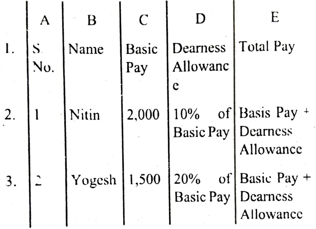
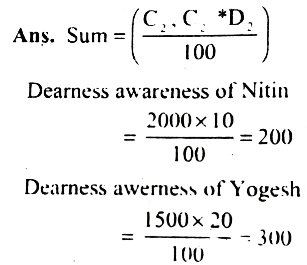
Q. 9. Write the steps to calculate Dearness Allowance and Total Pay of an employee in the Excel sheet given below:
Q. 10. Define the Flow chart.
Ans. Flow Chart: A flow chart is a type of diagram that represents an algorithm or process, showing the steps as boxes of various kinds, and their order by connecting these with arrows.
Q. 11. What do you mean by the Auto sum feature?
Ans. Auto suman feature will Add all contiguous numbers in a row or column.
For example, if you want to sum a entire column or row follow these steps:
(i) Click on the cell where you want the Sum.
(ii) Select the Formulas tab.
(iii) Click Auto Sum from the function library group.
(iv) Select Sum.
(v) Press Enter.
Q. 12. Write short notes on the Importance of Pie charts.
Ans. Importance of Pie charts: In a situation where one has to show the relative proportions or contributions to a whole, a pie chart is very useful. In case of pic chart only one data series is used. Small number of data points adds more to the effectiveness of pie charts.
Q. 13. Answer the following:
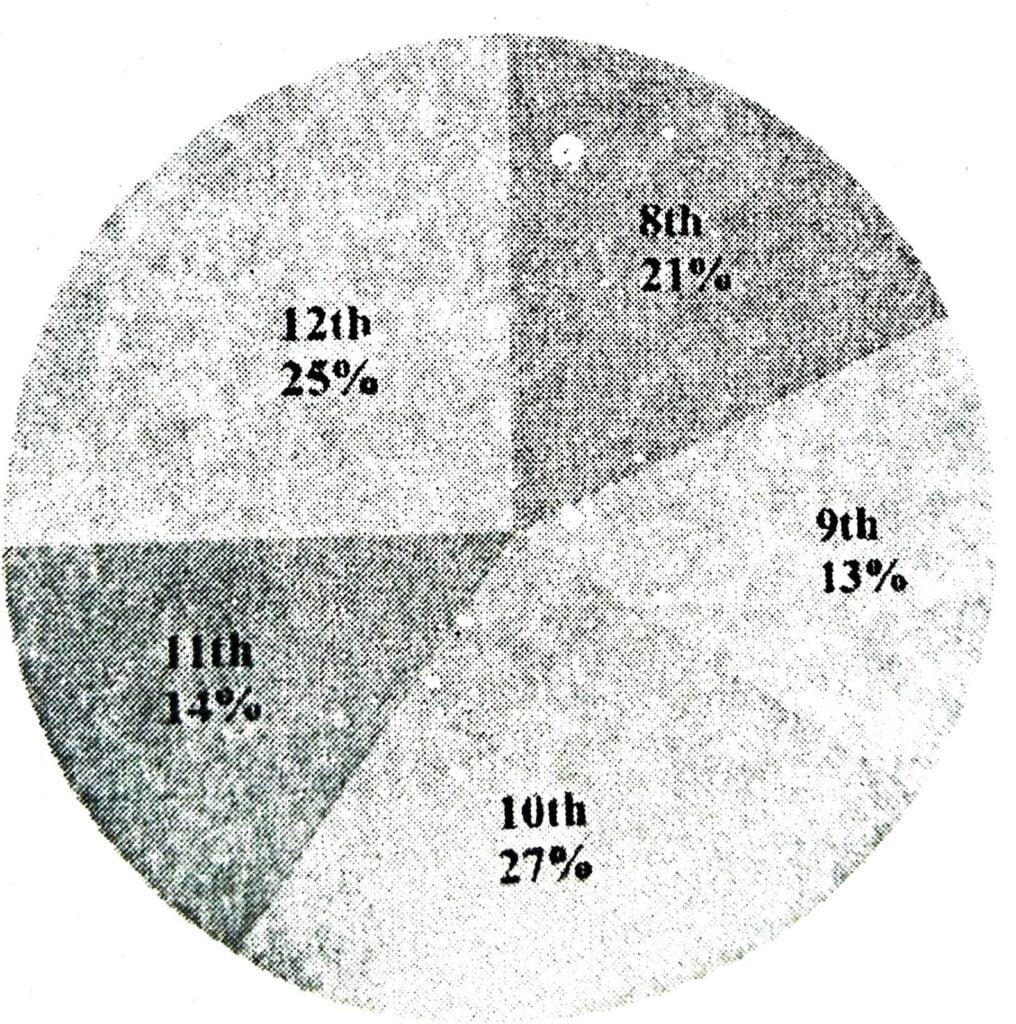
(a) In a reputed school of Delhi the pass percentage of students for the last academic year 2009-2010 is given below for classes 8th and 12th plot a pie chart based on the following data. Write the steps and roughly draw the chart.
Class 8th – 21%
Class 9th – 13%
Class 10th – 27%
Class 11th 14%
Class 12th – 25%
(b) If a range contains the values as following in an Excel worksheet.
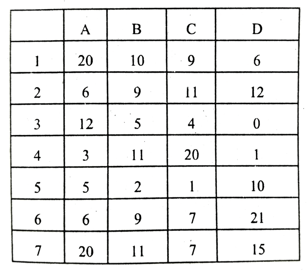
Based on the above data, write the output of the following functions:
(i) = SUM (A1: B7)
(ii) = SUM (C1: D7)
(iii) = MAX (A1: D7)
(iv) = MIN (B1: D7)
Ans. (a) Following are the steps to construct a pie chart:
(i) Enter the given data in the work sheet.
(ii) Now select data range: By using the mouse high light the range of data.
(iii) Click Insert Tab and select pie chart from the chart group.
(iv) Press Enter.
(b) (i) 129.
(ii) 124.
(iii) 21.
(iv) 0.
Q. 14. Write down the formula of Sum and Sum if.
Ans. Sum (): Adds all the numbers in a range of cells.
Syntax SUM (number of number 2, …)
Maximum number of arguments can be 255. For example, if you want a sum of cell A3 and B5 write the formula as = Sum (A3,B5)
SUMIF (range, criteria, sum_range): This form of sum functions is used to add the cells with respective to a given criteria. For ex. if you want to add cells from B1 to H1 with a condition that the sum of only the numbers less than 20 will be added than the formula will be:
= SUMIF (BI:HI,”<20″,BI:HI)
Q. 15. Write down the formula of Average function, Min function and Max function.
Ans. Average function (): It helps you to get the average of the numbers. It returns the average (arithmetic mean) of the arguments.
Syntax: AVERAGE(number, number2,…)
Min function (): It helps you to get the minimum of the numbers. Returns the smallest number in a set of values.
Syntax: MIN(number1,number2,…)
Max function (): It helps you to get the maximum of the numbers. Returns the largest number in a set of values.
Syntax: MAX(number1,number2,…)
Q. 16. What do you mean by Chart in MS Excel? Write its 5 types in detail.
Ans. Chart is a very powerful feature of MS Excel 2007 which display the data in many ways as per the user need. There are many Charts option available in MS Excel, some of these are following:
(i) Bar Charts: Bar charts are used to show comparisons between individual items. To make a bar chart the data should be arranged in the form of rows and columns on a worksheet.
(ii) Column Charts: This type of chart is used to compare values across categories. They give very effective results to analyze the data of the same category on a defined scale.
(iii) Line Charts: Data represented in columns or rows in a worksheet can be plotted with the help of line chart. Line charts can be used to display continuous data over time with respect to a common scale.
(iv) Pie charts: In a situation where one has to show the relative proportions or contributions to a whole, a pie chart is very useful. In case of pie chart only one data series is used.
(v) Radar charts: The radar charts compare the aggregate values of a number of data series.
Radar chart can be plotted with the data which is arranged in columns or rows on a worksheet.

Hi! my Name is Parimal Roy. I have completed my Bachelor’s degree in Philosophy (B.A.) from Silapathar General College. Currently, I am working as an HR Manager at Dev Library. It is a website that provides study materials for students from Class 3 to 12, including SCERT and NCERT notes. It also offers resources for BA, B.Com, B.Sc, and Computer Science, along with postgraduate notes. Besides study materials, the website has novels, eBooks, health and finance articles, biographies, quotes, and more.